Soundcloud App Redesign
UI/UX, 2022.


Date
August, 2022.
Tools
Miro, Figma.
Scope
UI/UX, Wireframing, Prototyping
Overview
Soundcloud is a music streaming platform with over 76 million active users. Due to its emphasis on independent music — you may upload your recording/track to Soundcloud for other people to listen to — it has a much different selection of music than its rivals. exciting, right?!
My friend who introduced me to Soundcloud sent me a link to one of SZA’s unreleased songs. I created an account and quickly browsed the app, but I wasn’t particularly impressed with the user interface compared to other major music services. I conducted some informal research by asking around, and I got some support.
This affected my choice to start the platform redesign.
User Research
I obtained user reviews online from the AppStore, Google, and Trust pilot because the app was already out. I came up with two main objectives for the makeover after carefully considering certain significant facts. These objectives are:
Redesign the User Interface of the app and make key features more accessible
Implement new features for a better user experience.
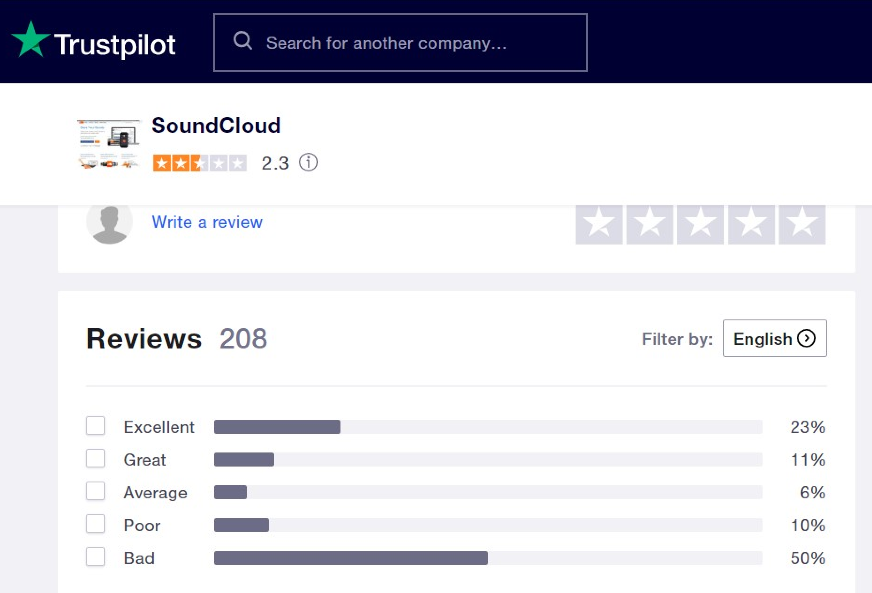
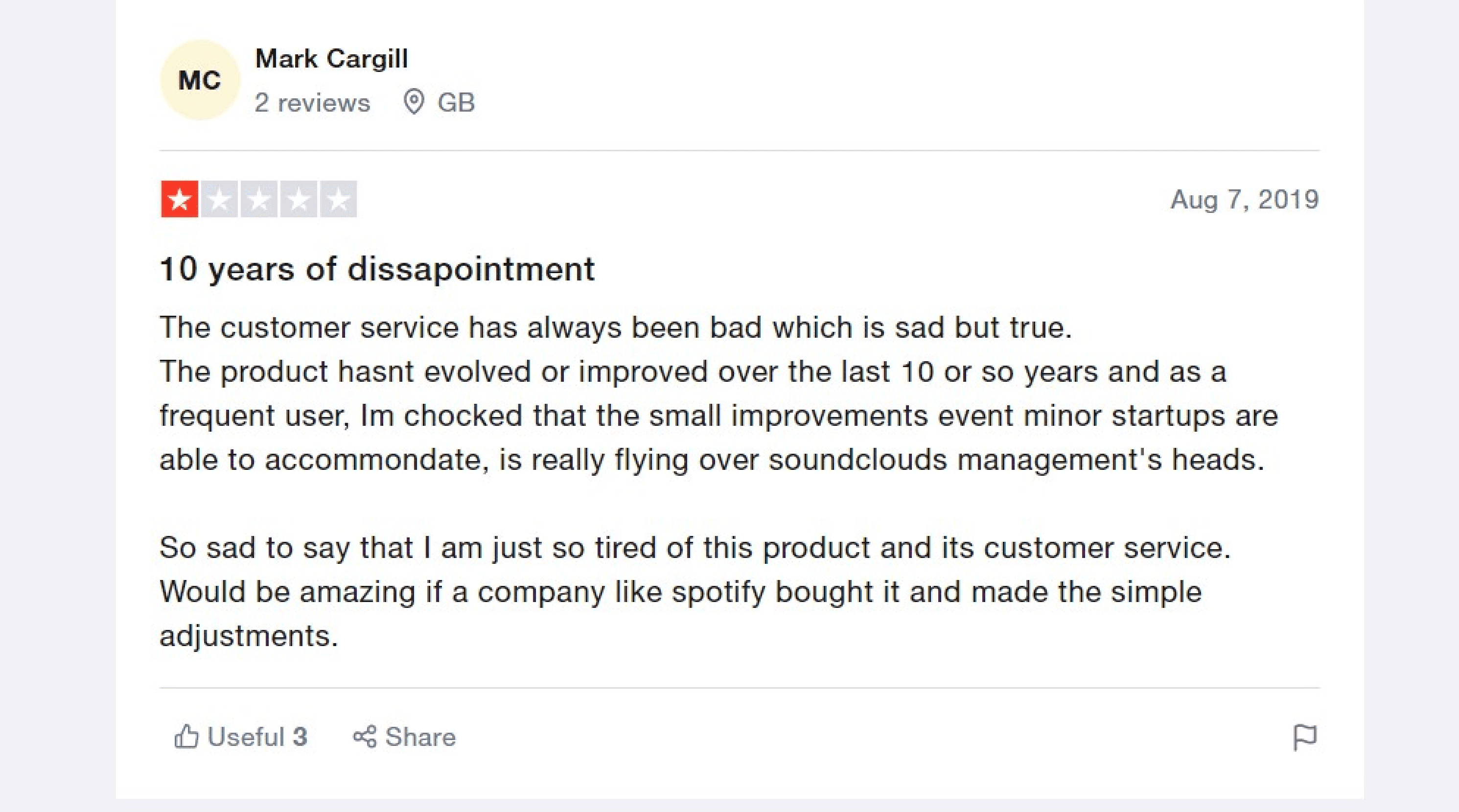
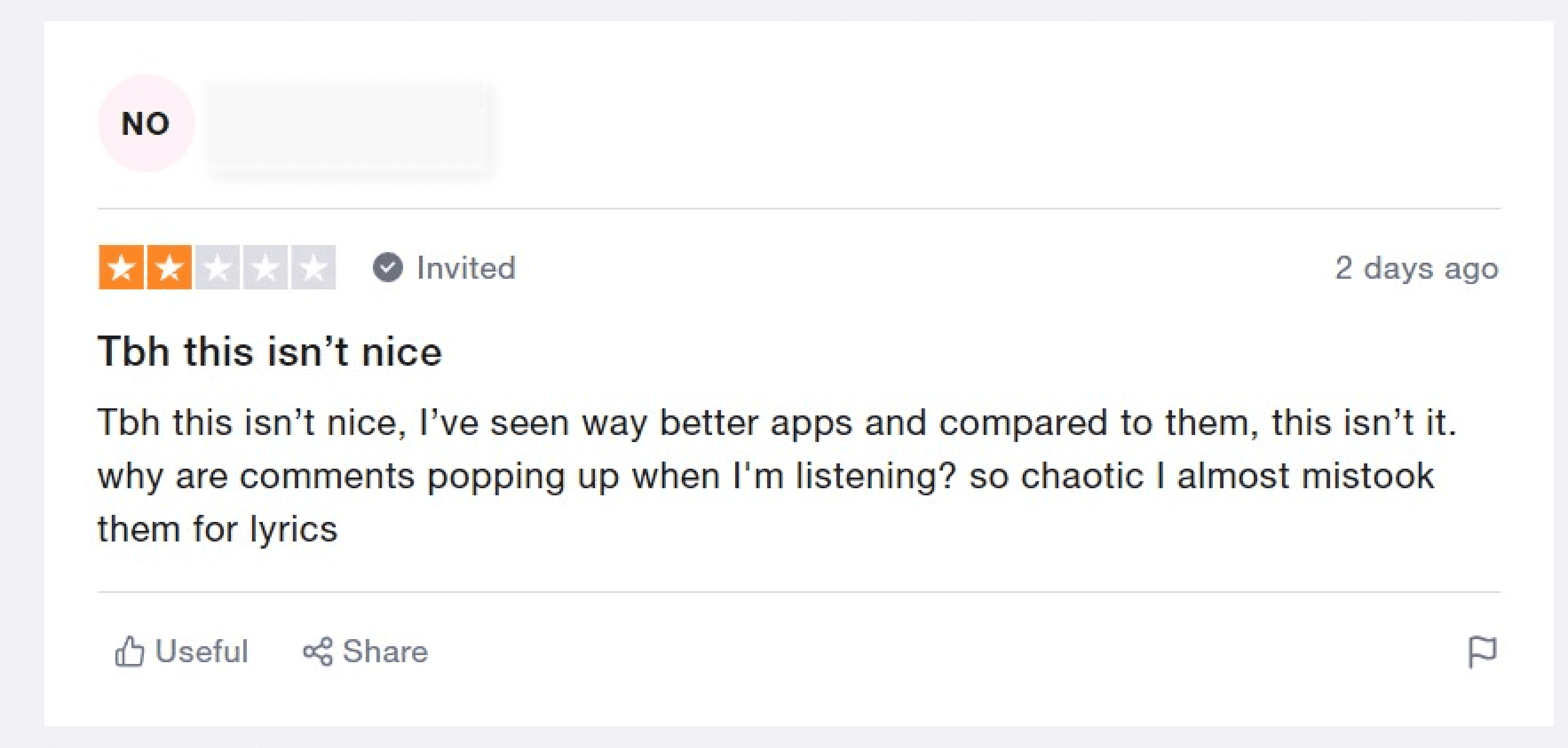
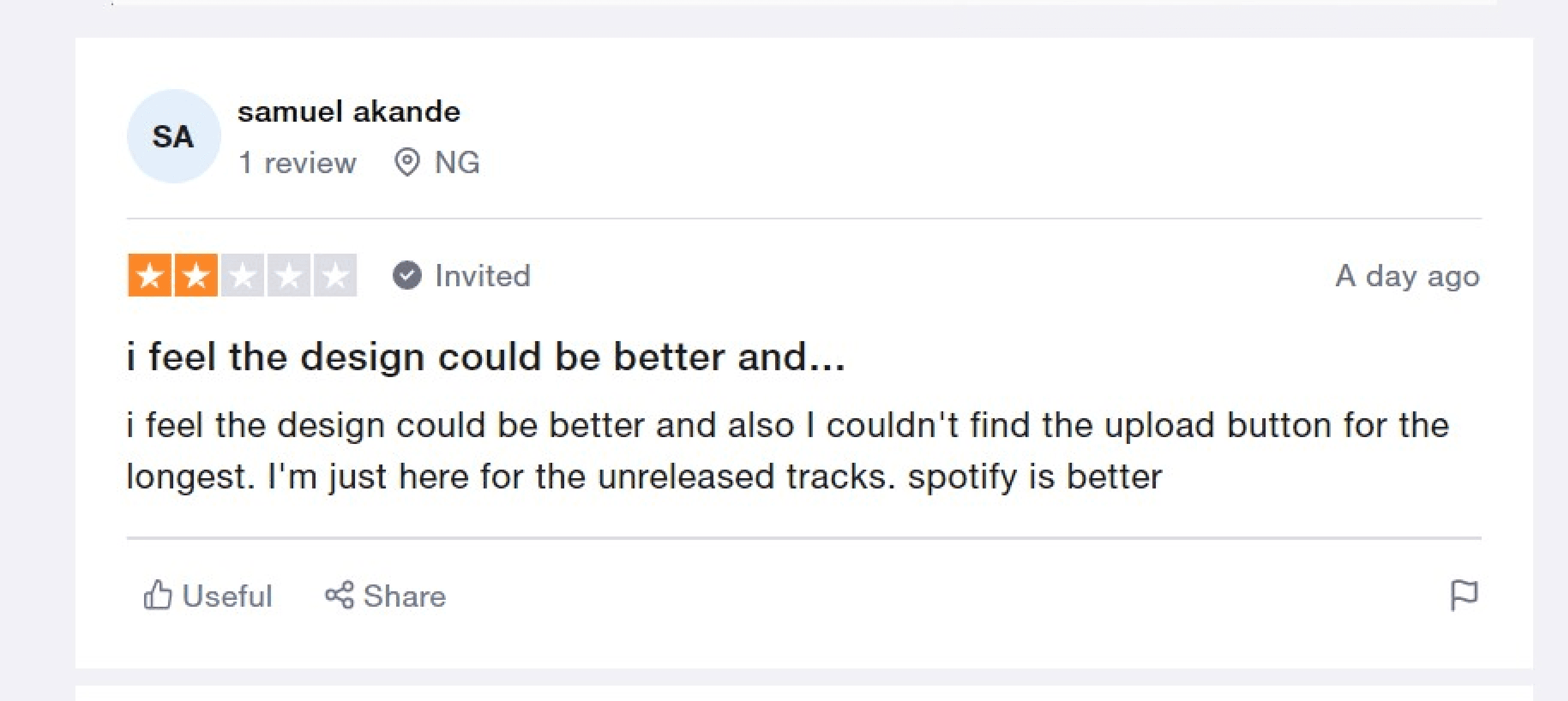
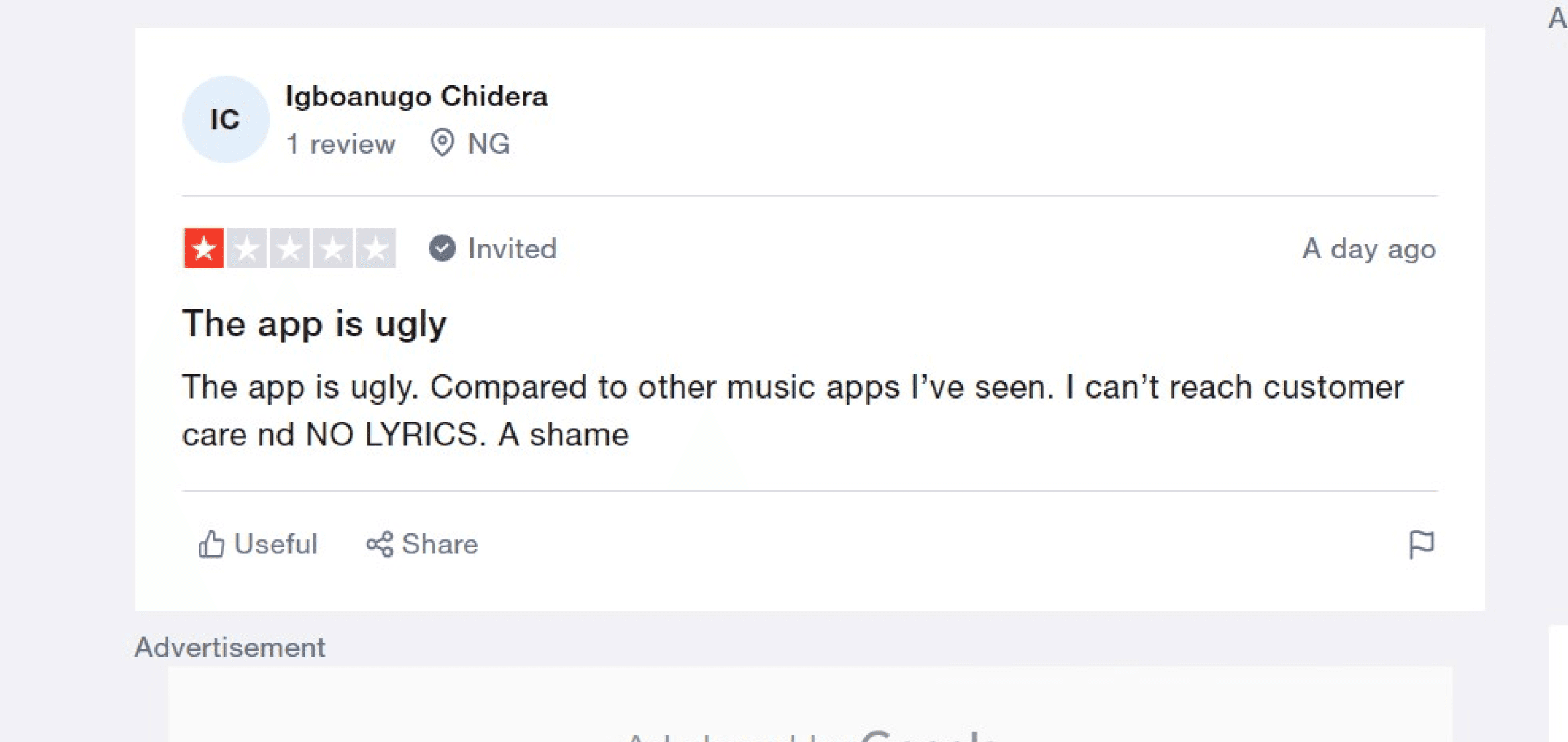
Some reviews from Trustpilot
Problems
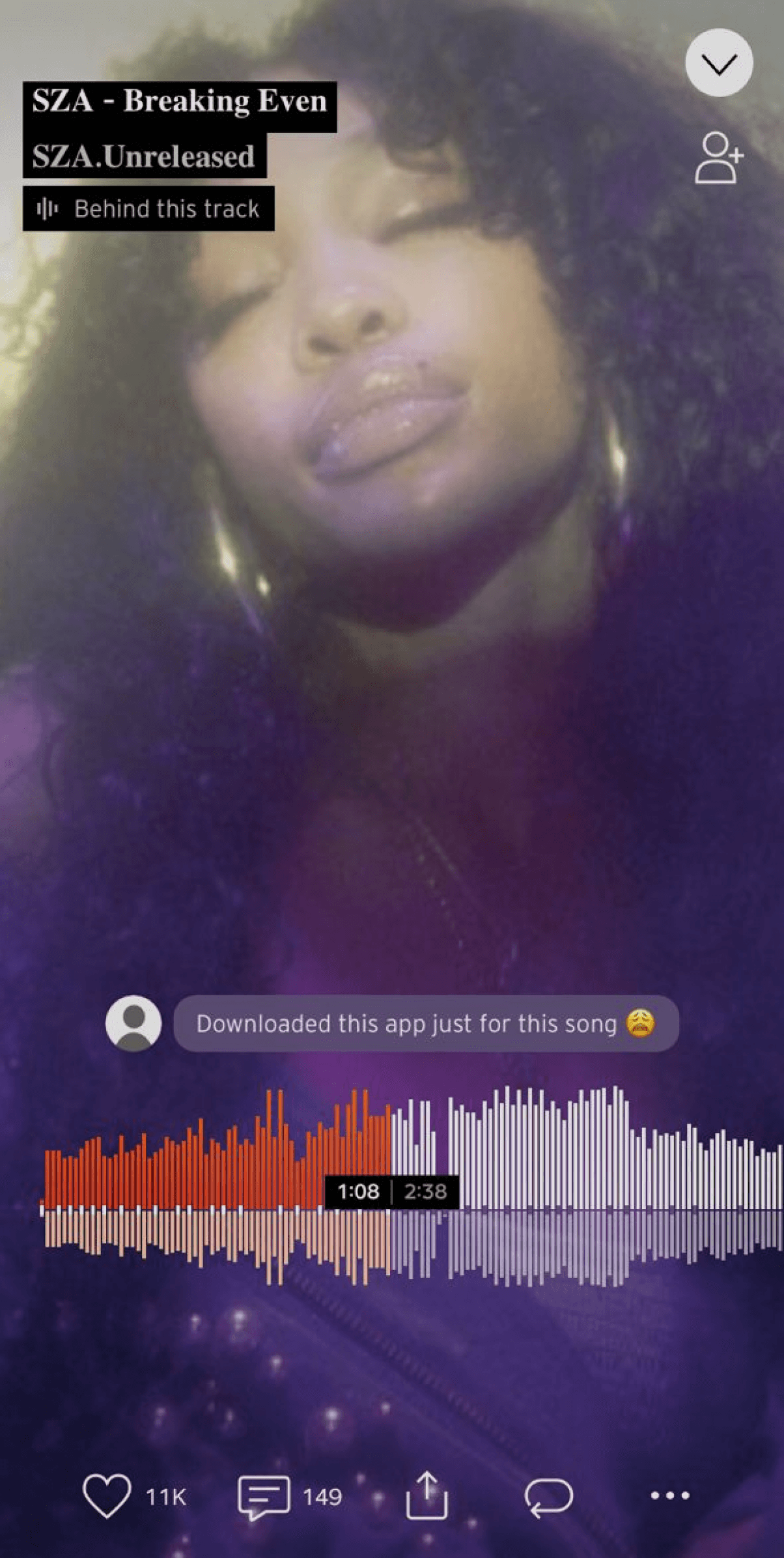
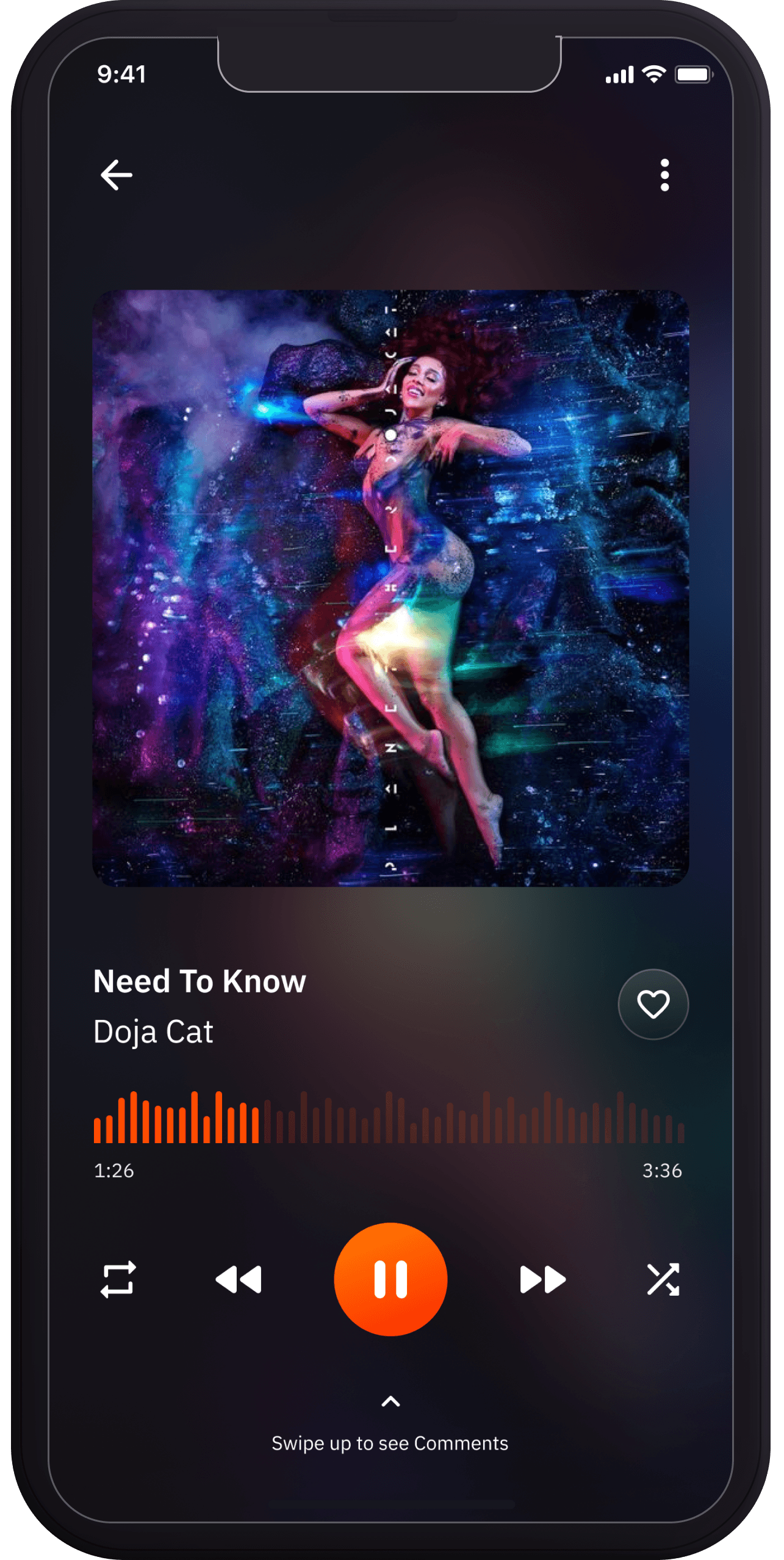
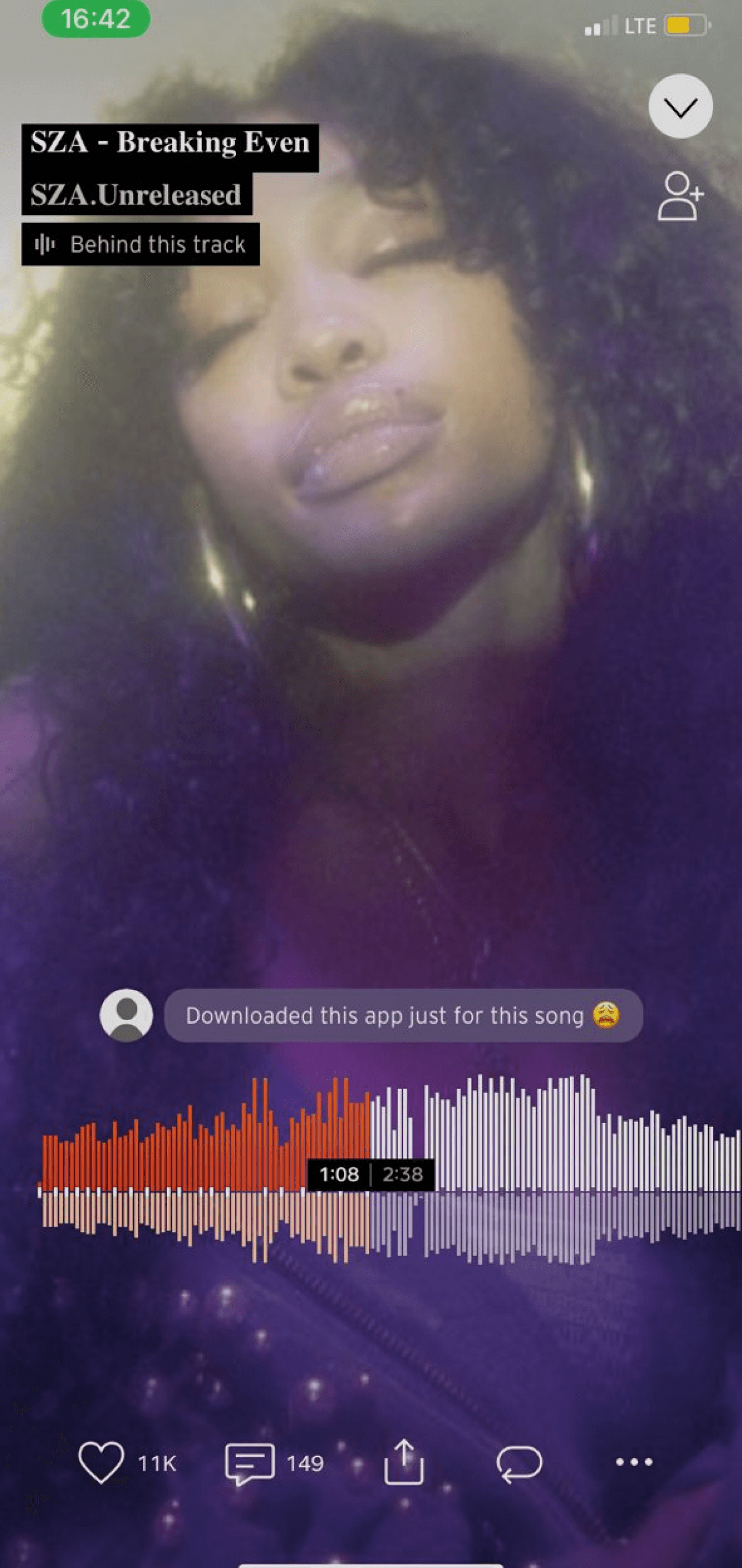
Comments on each track and absence of lyrics
The comments currently appear on Soundcloud while users are playing music, which might be distracting. According to the Trust Pilot reports, several users initially thought the comments were lyrics.
Making the comments a modal that the user can make visible or invisible is one way to fix the aforementioned issue.

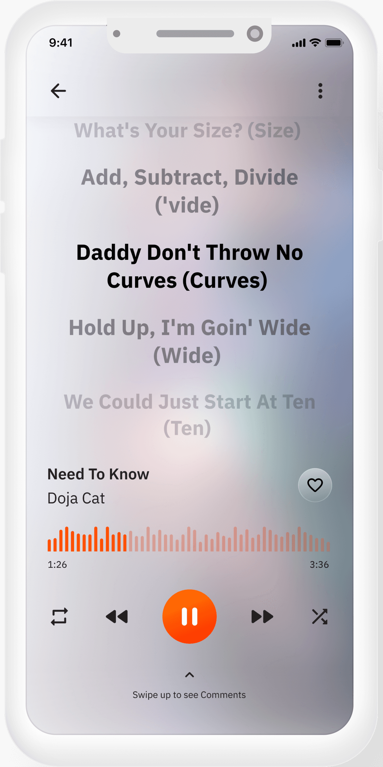
current play screen and comment pop up
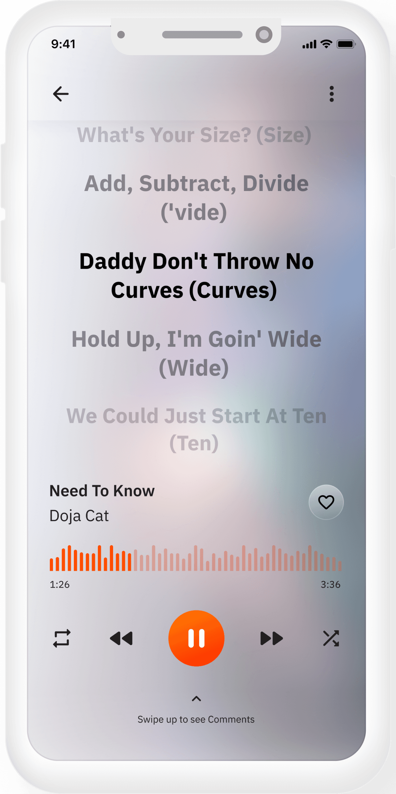
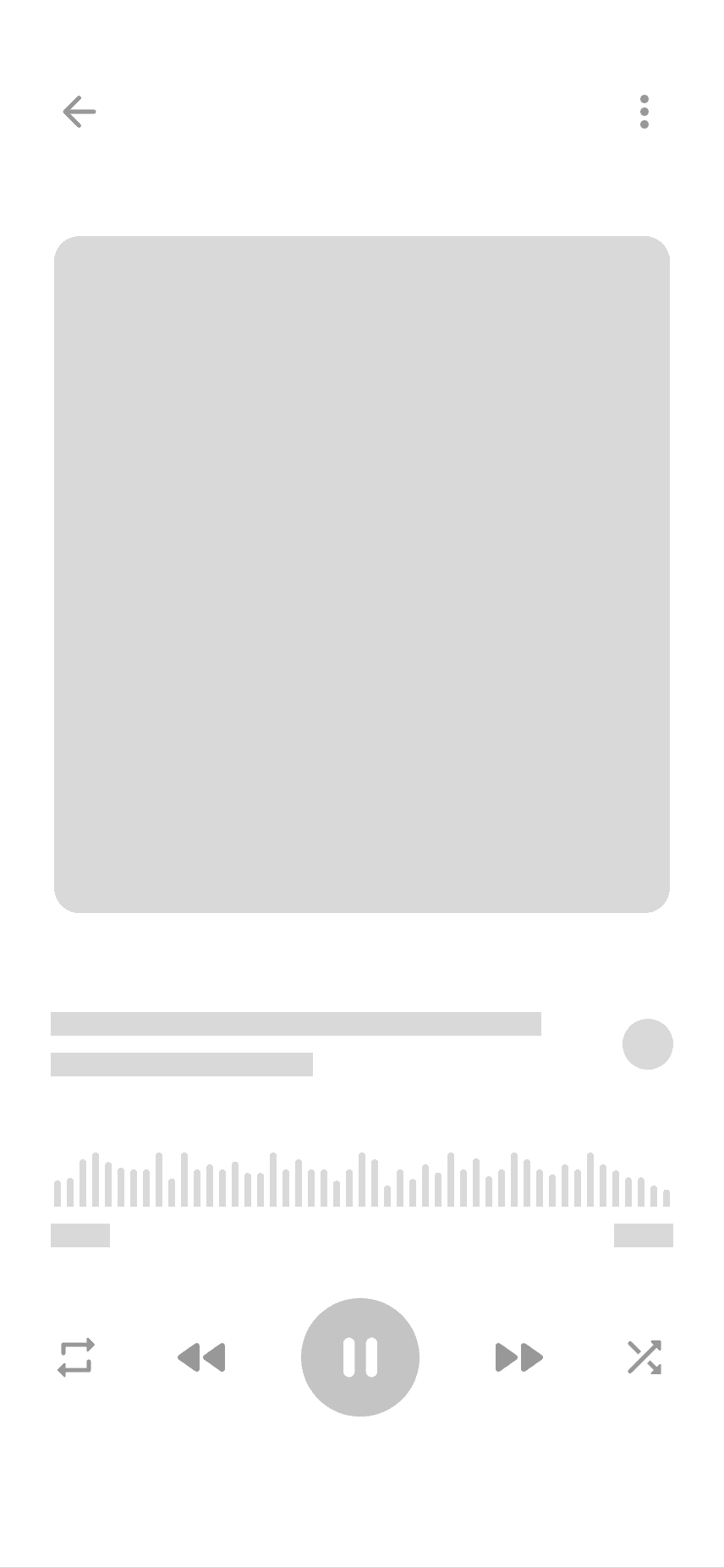
New Playscreen
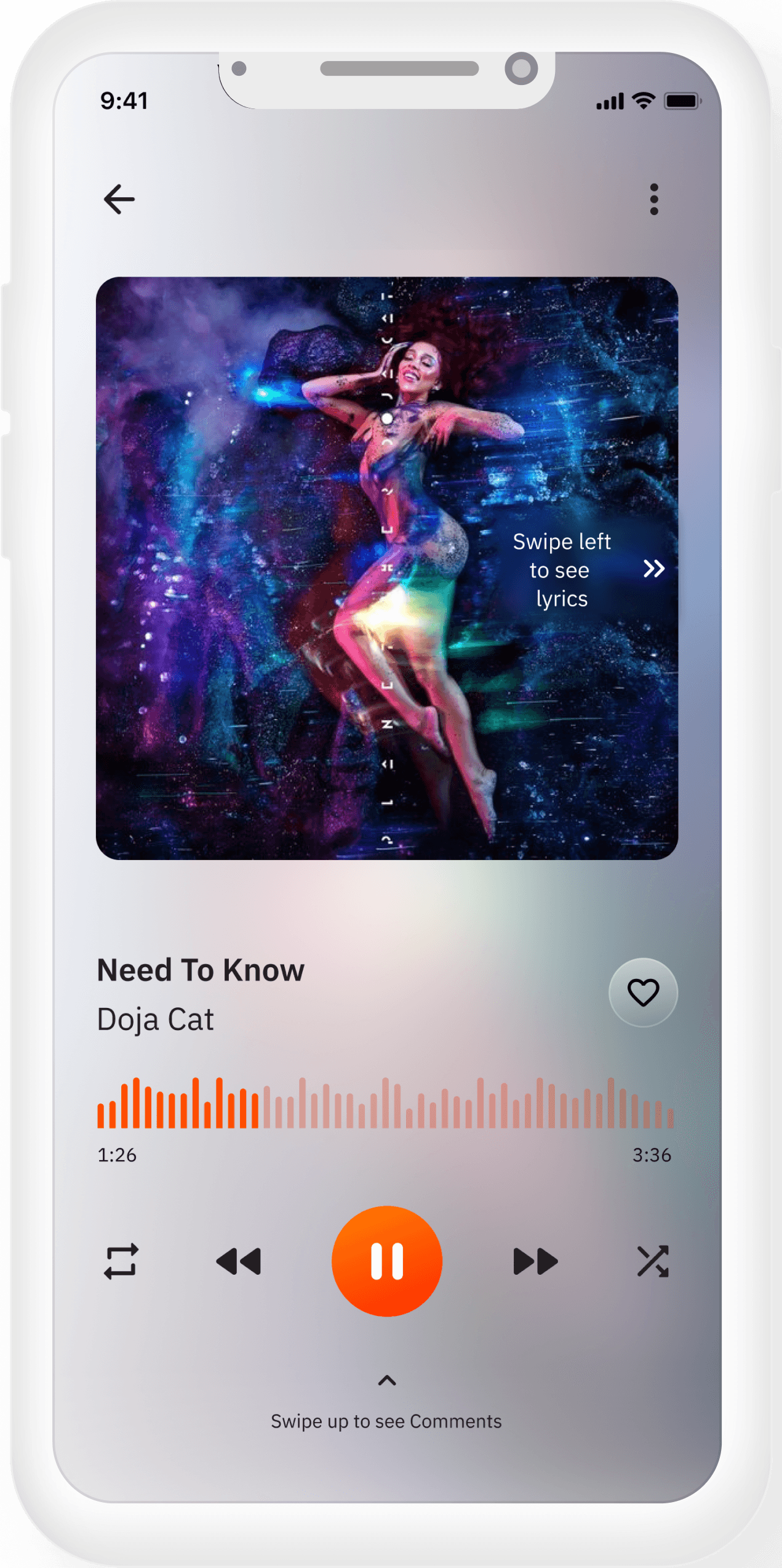
Comments as a modal
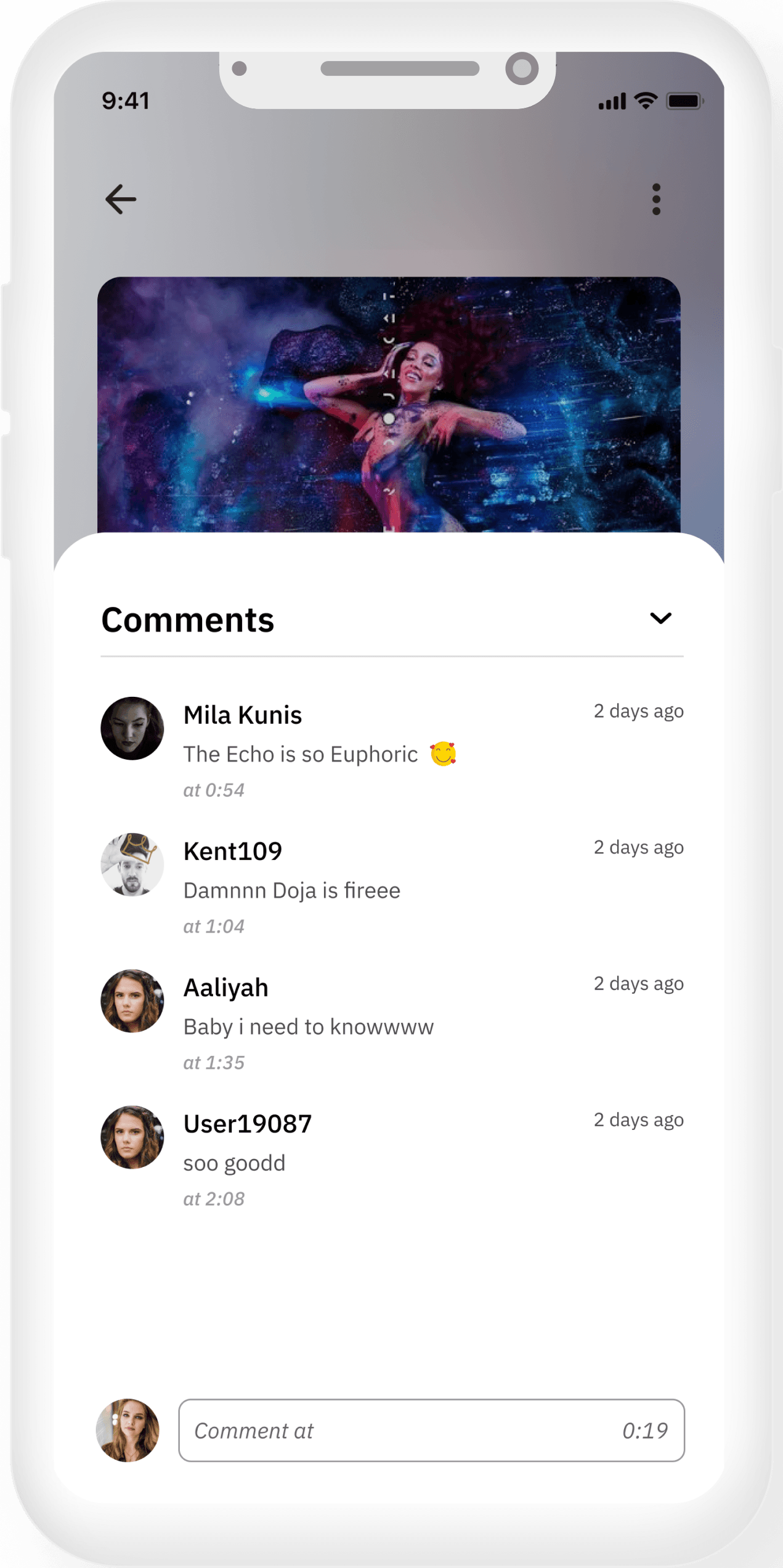
Lyrics available
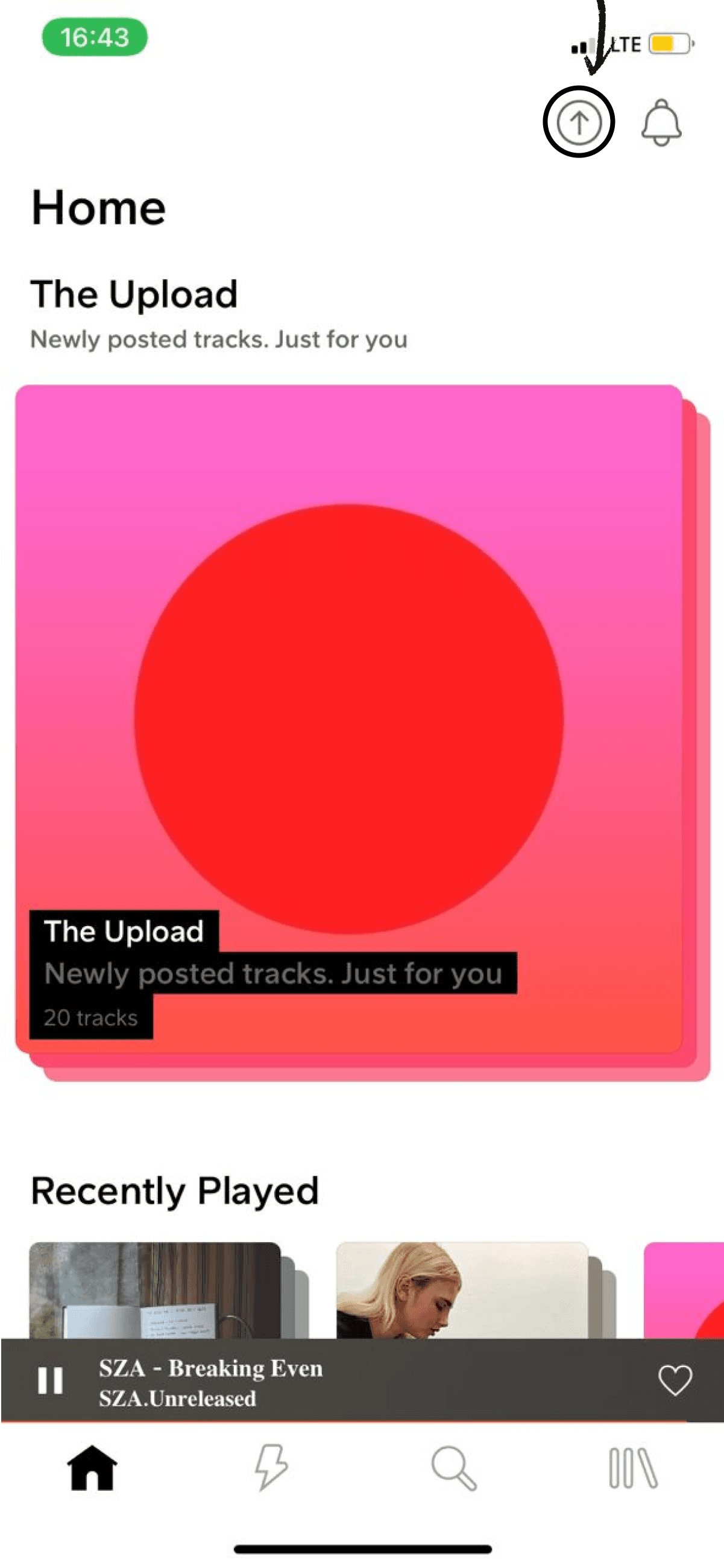
Upload Button is not readily visible
SoundCloud's ability to upload original music is one feature that sets it different from its competitors. I didn't know I could upload tracks when I first started using the App (until I accidentally found the upload button, that is).
Most People might ignore the "upload button" because it resembles every other icon perfectly.
current Upload Button
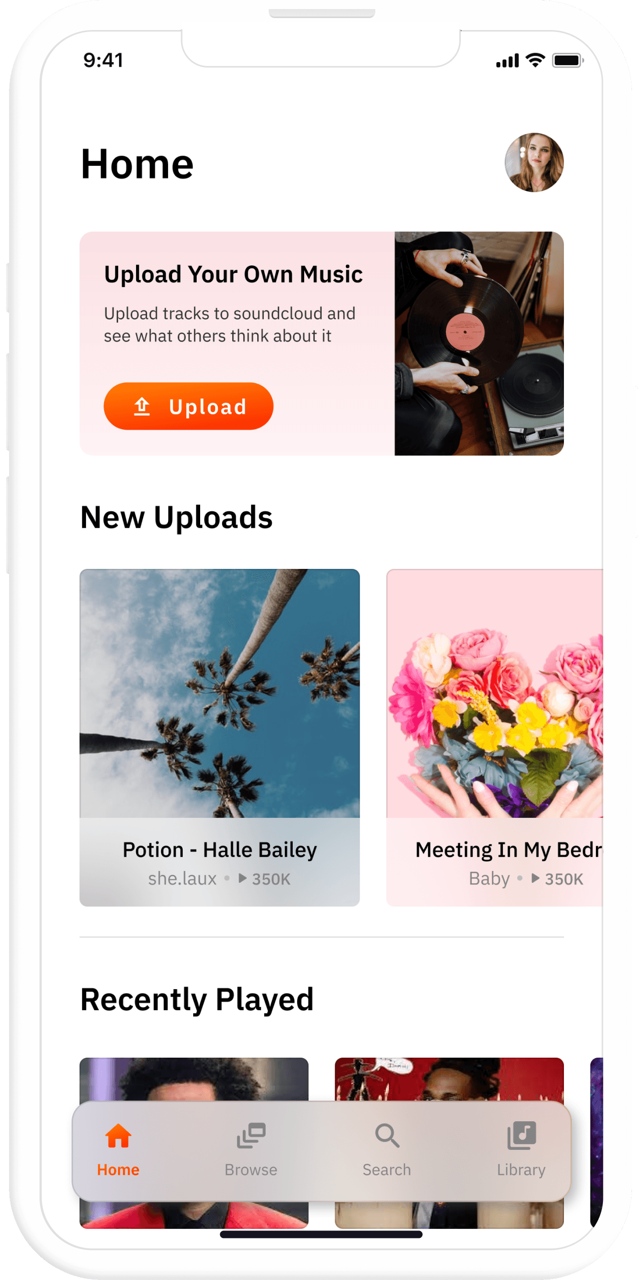
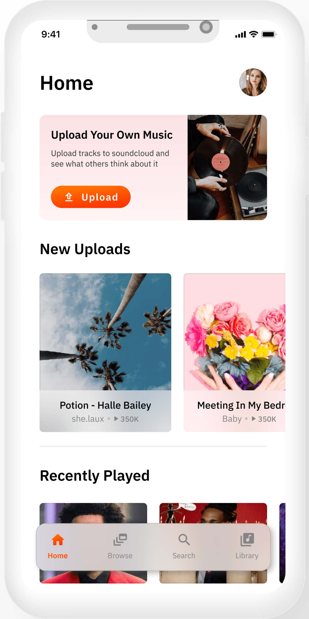
Visible Upload Button
Design Process
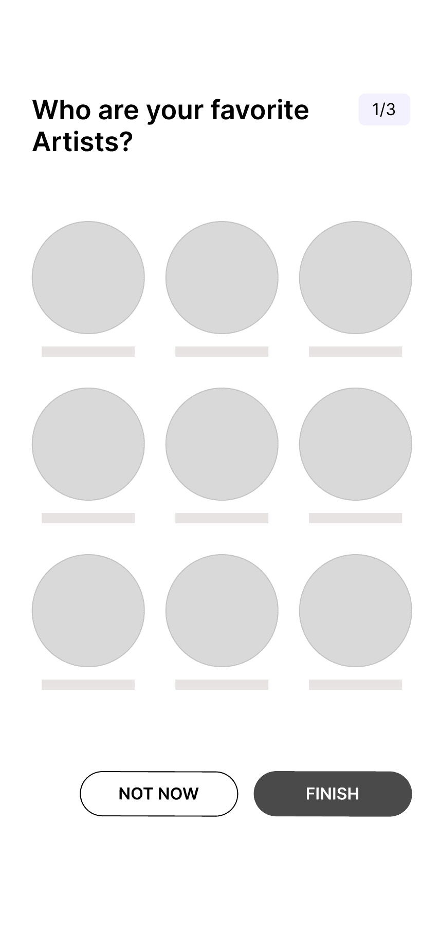
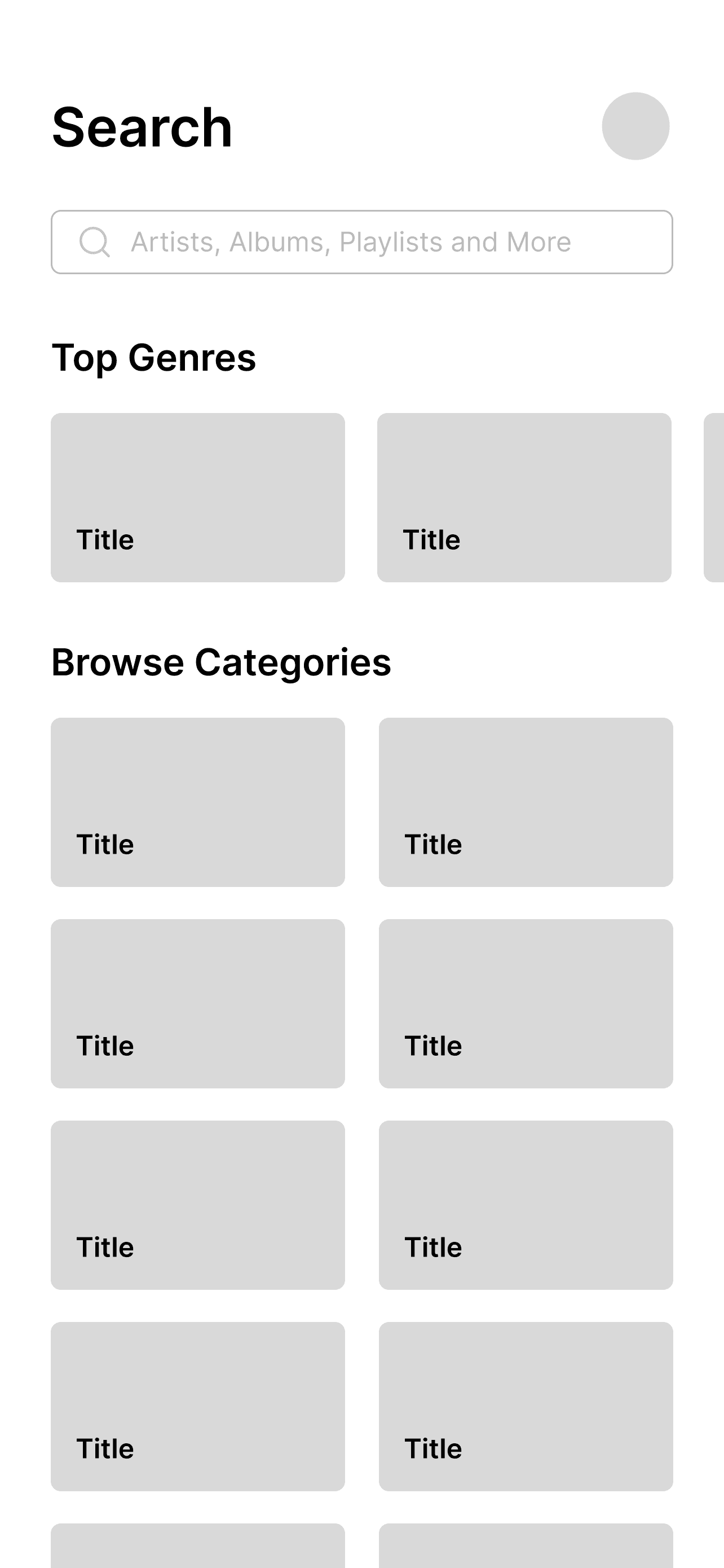
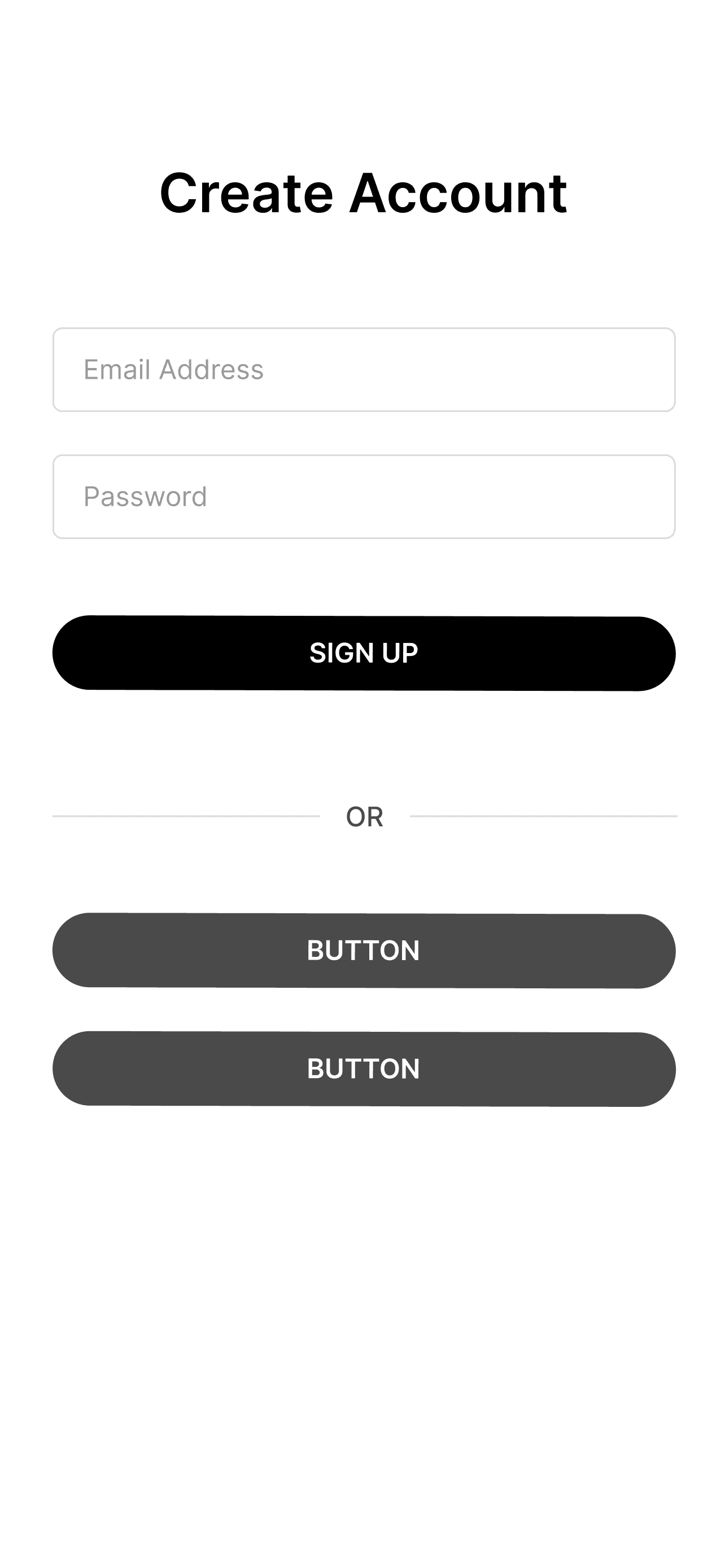
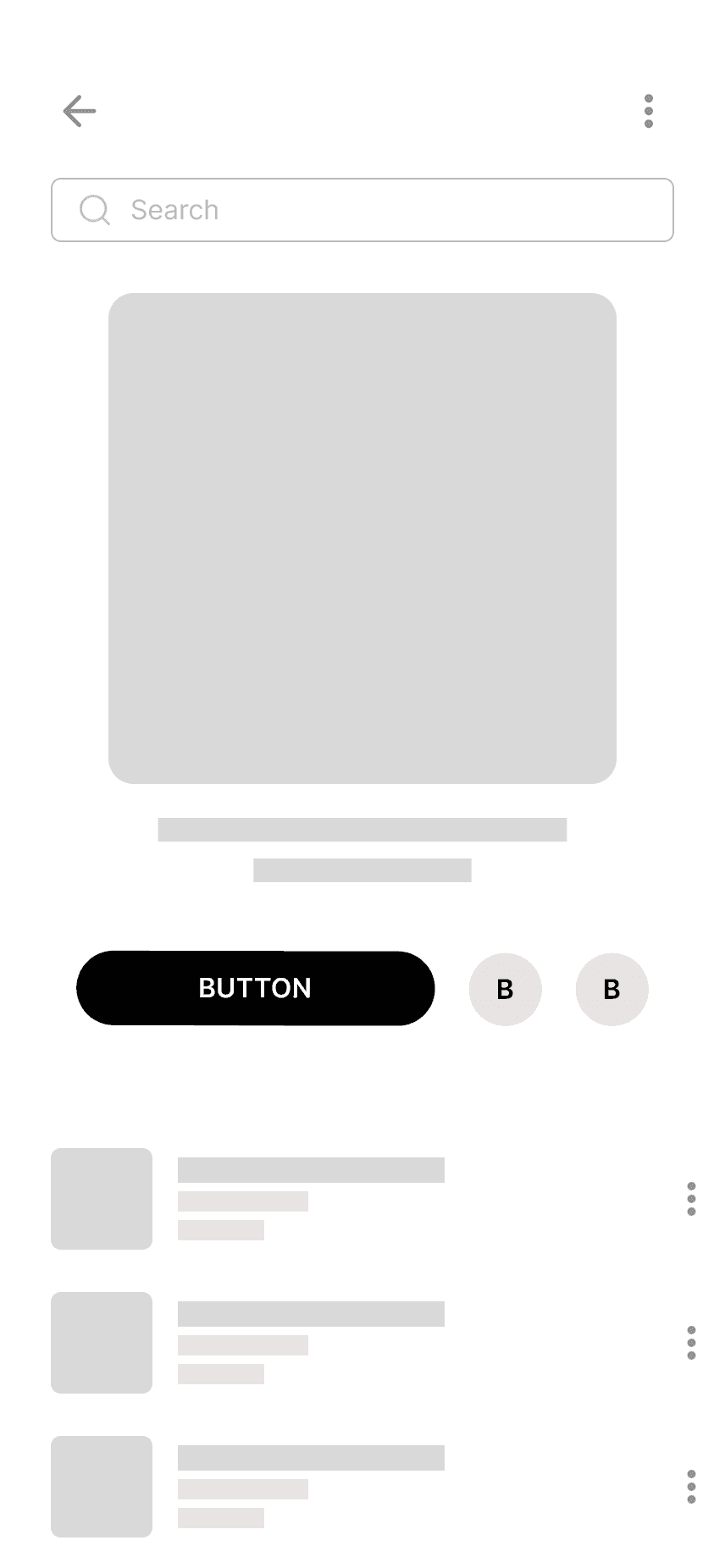
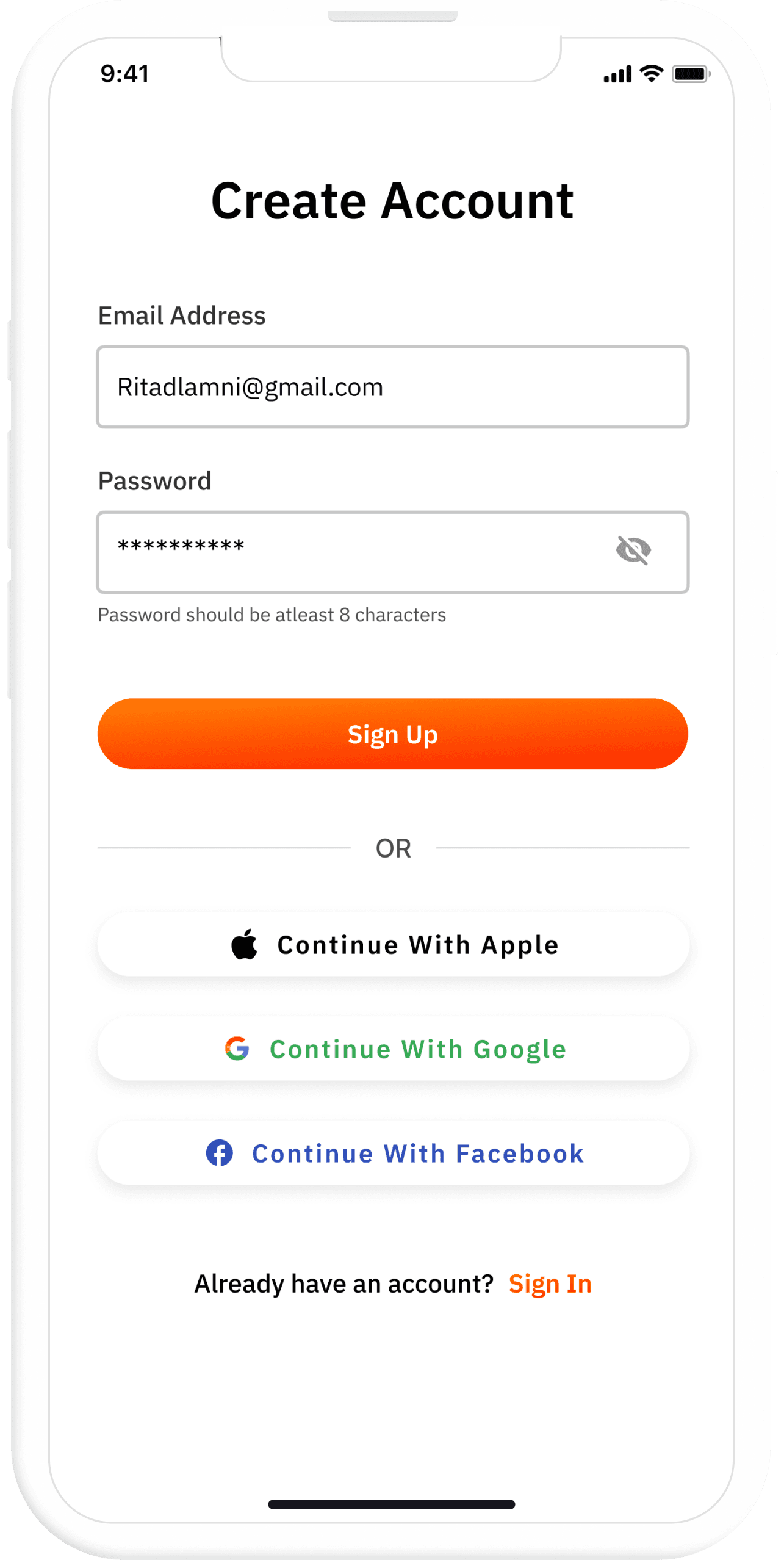
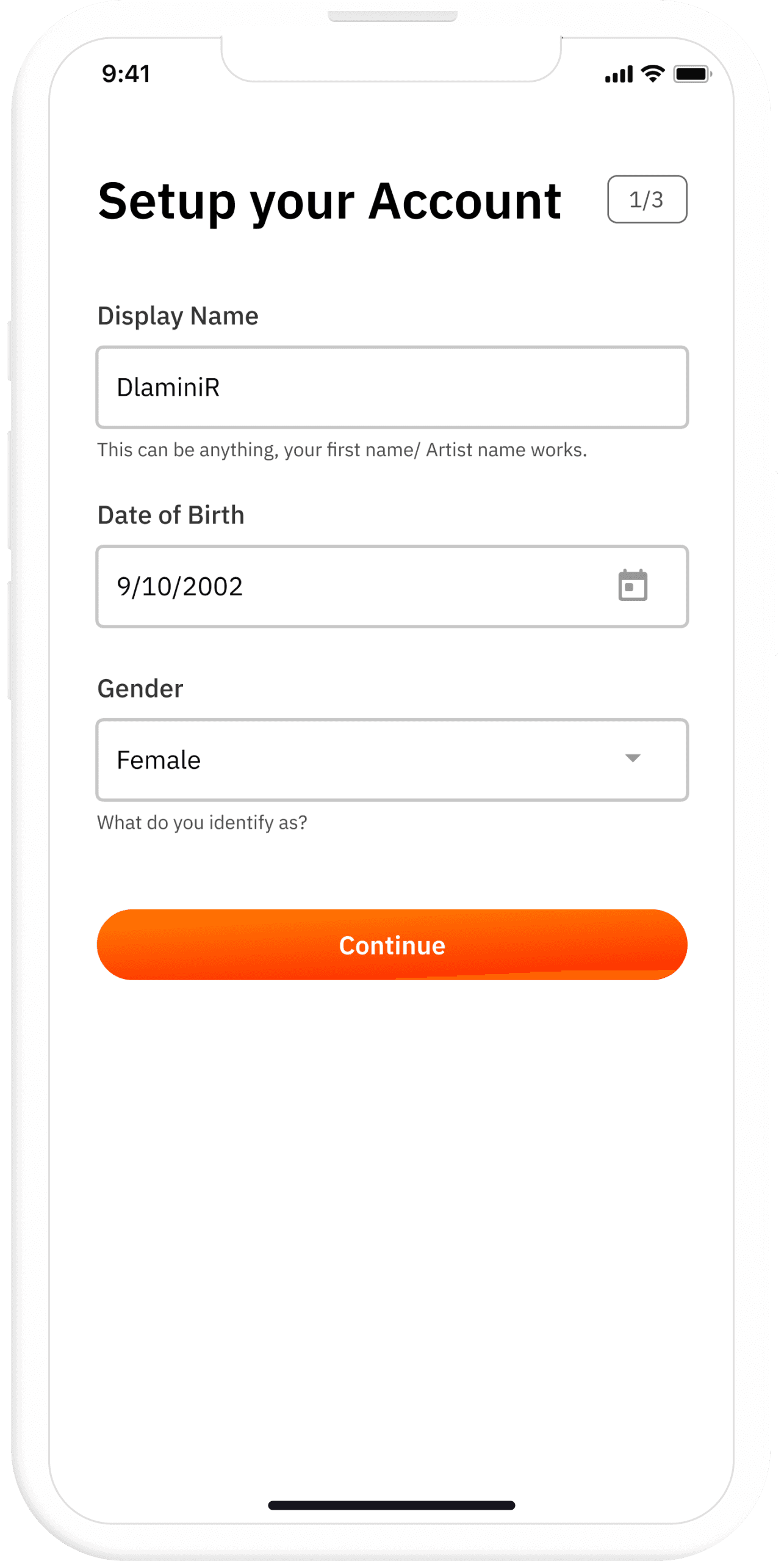
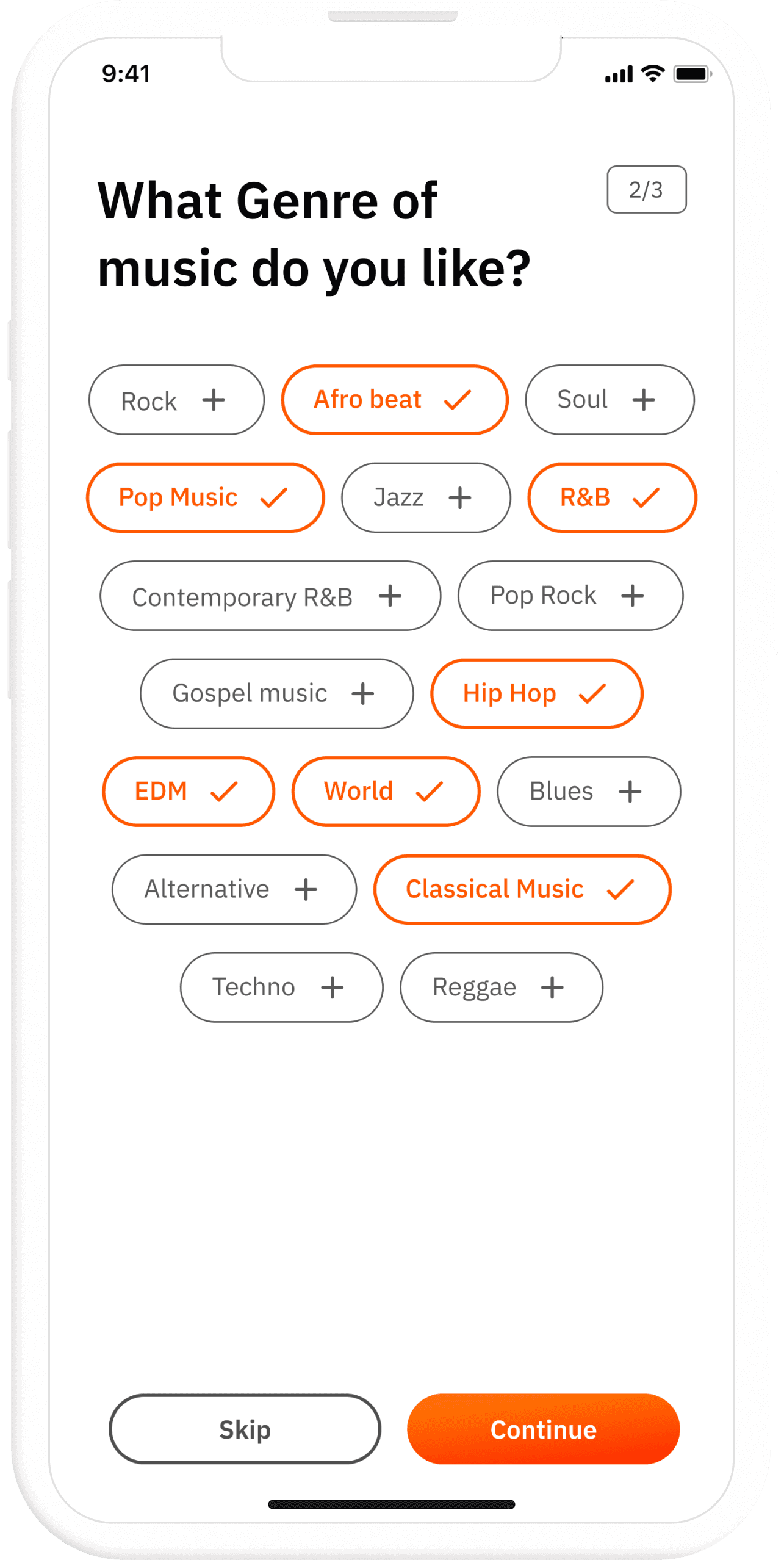
After finding out the main problems, and brainstorming for new features, I started the design process. I created wireframes for each page relevant to the case study (Authentication and Onboarding, home, play screen, search)
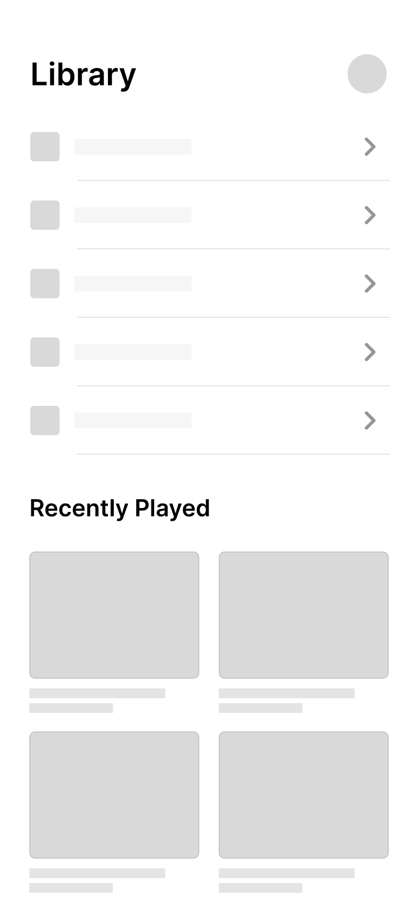
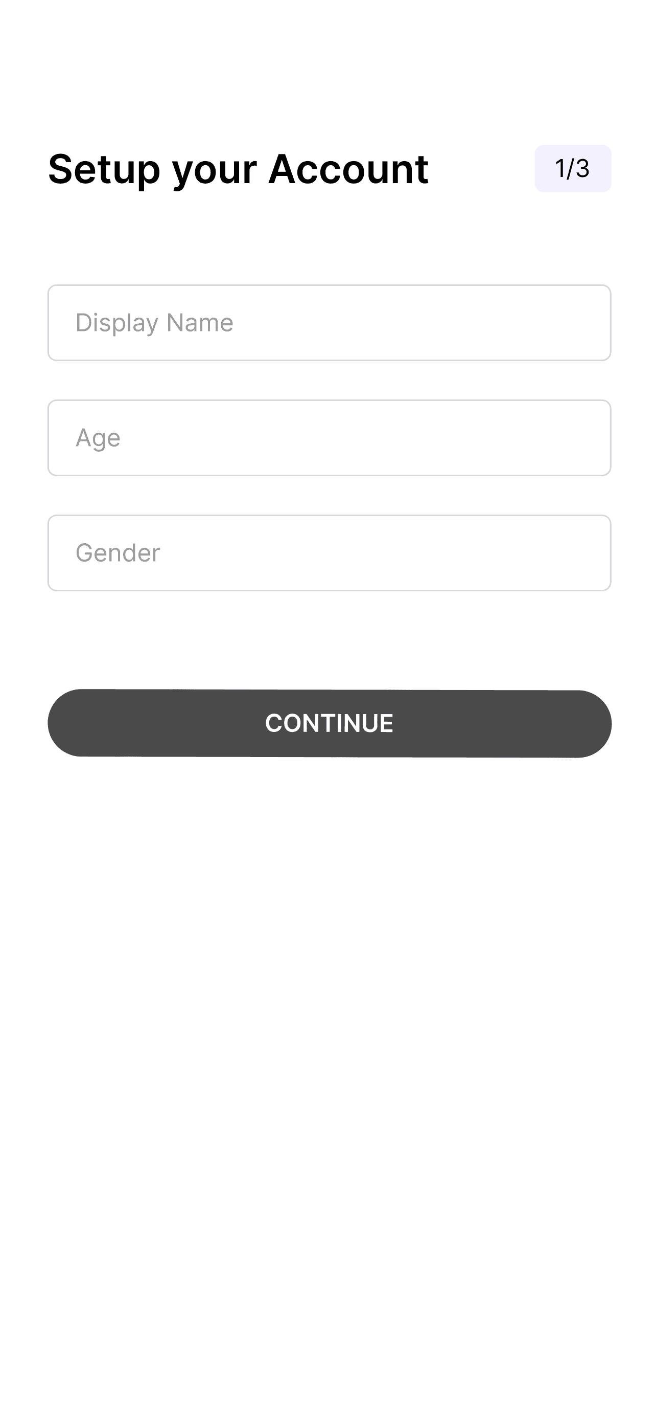
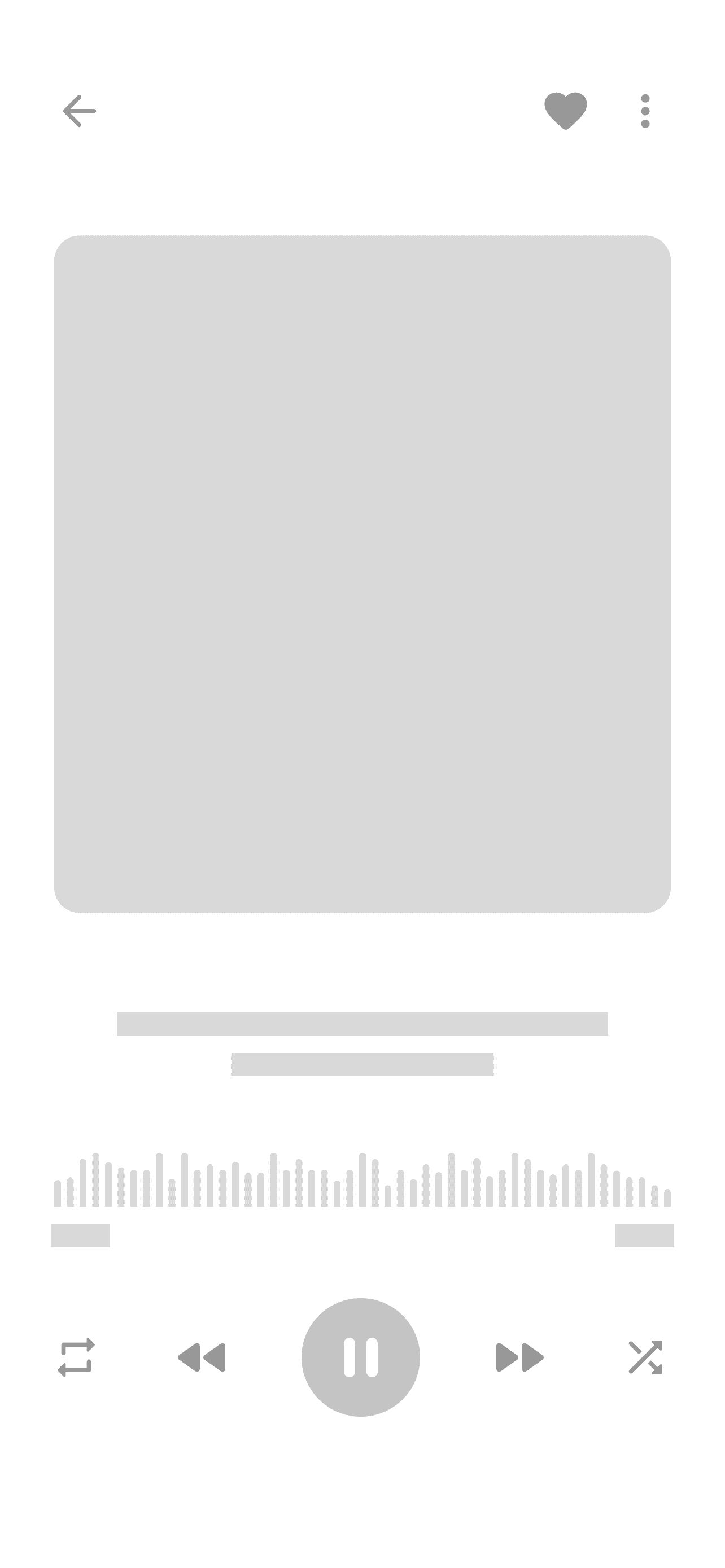
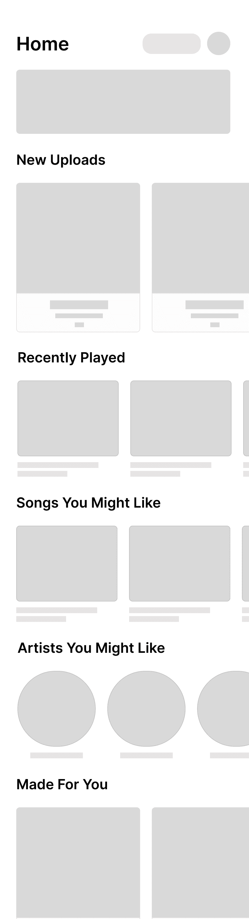
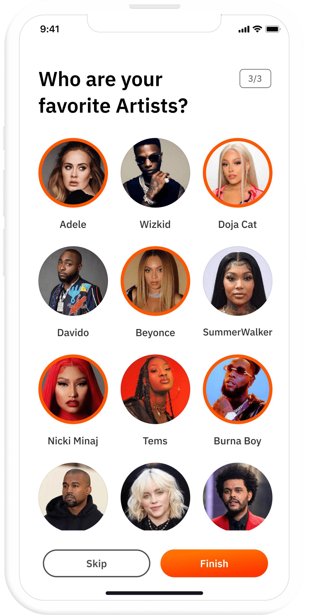
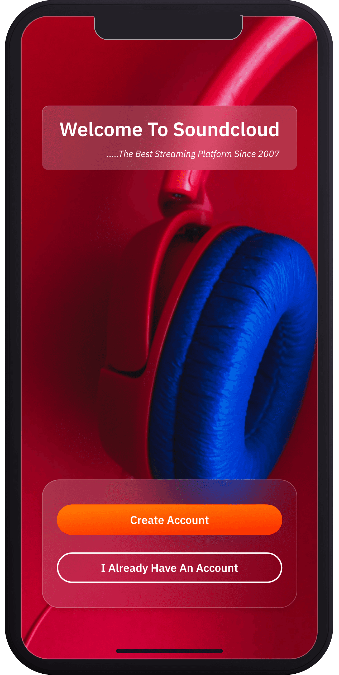
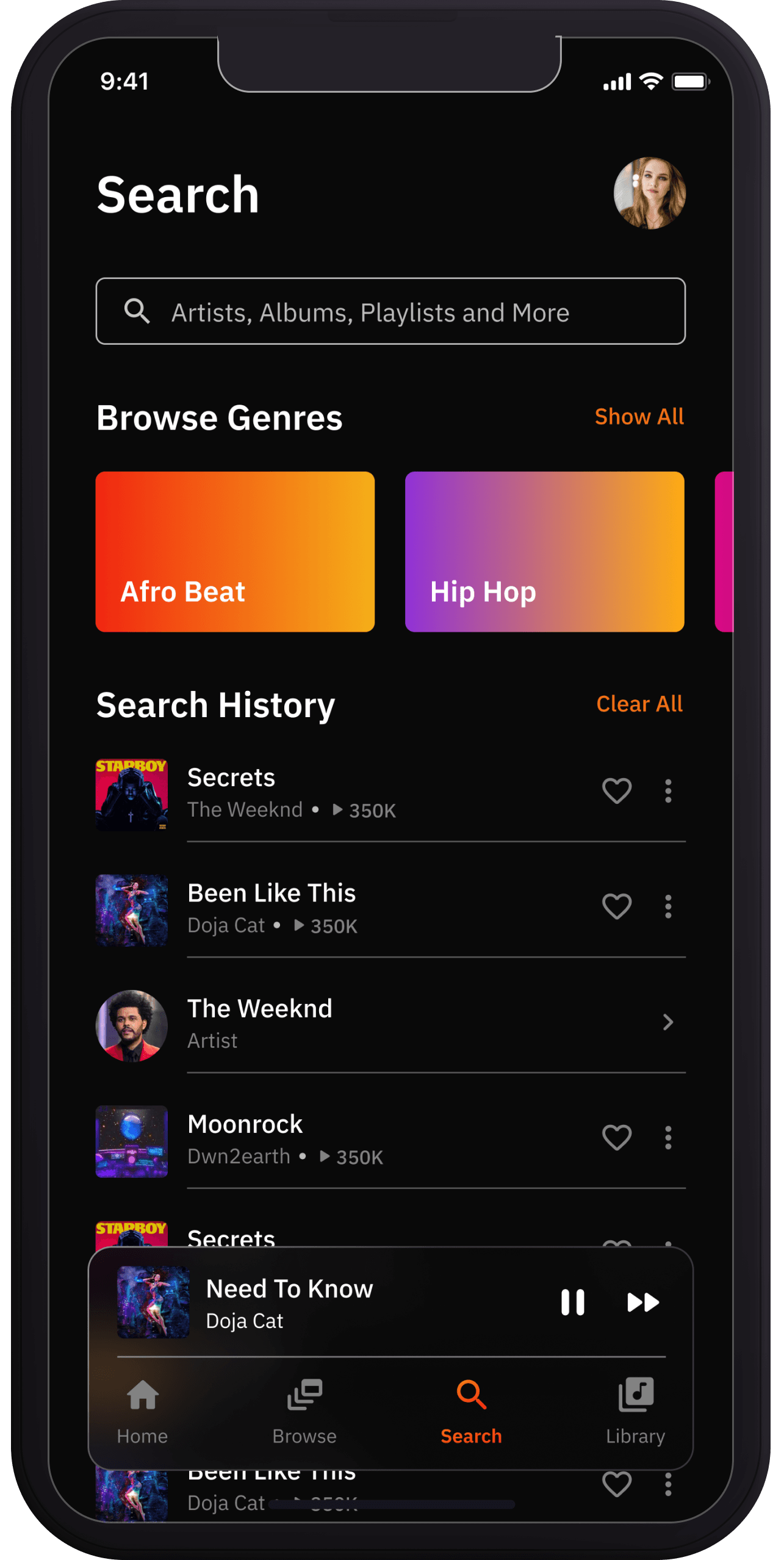

For the High Fidelity, I decided to use the Grommet design system and also design light and dark themes. I used the IBM Plex Sans font family all through the redesign process of the app. For colors, I used Soundcloud’s main color — Orange. Linear gradient of #FF7403 — #FD3501. Here are some screens from the app:
Thank you for reading!
Test prototype here:
** Preferably on a pc**
Next Project
Metrodao


Copyright © 2023 | Chisom Igboanugo
Made with love and lots of Caffeine
Soundcloud App Redesign
UI/UX, 2022.

Date
August, 2022.
Overview
Soundcloud is a music streaming platform with over 76 million active users. Due to its emphasis on independent music — you may upload your recording/track to Soundcloud for other people to listen to — it has a much different selection of music than its rivals. exciting, right?!
My friend who introduced me to Soundcloud sent me a link to one of SZA’s unreleased songs. I created an account and quickly browsed the app, but I wasn’t particularly impressed with the user interface compared to other major music services. I conducted some informal research by asking around, and I got some support.
This affected my choice to start the platform redesign.
Tools
Miro, Figma.
Scope
UI/UX, Wireframing, Prototyping
User Research
I obtained user reviews online from the AppStore, Google, and Trust pilot because the app was already out. I came up with two main objectives for the makeover after carefully considering certain significant facts. These objectives are:
Redesign the User Interface of the app and make key features more accessible
Implement new features for a better user experience.
Some reviews from Trustpilot
Upload Button is not readily visible
SoundCloud's ability to upload original music is one feature that sets it different from its competitors. I didn't know I could upload tracks when I first started using the App (until I accidentally found the upload button, that is).
Most People might ignore the "upload button" because it resembles every other icon perfectly.
Problems
Comments on each track and absence of lyrics
The comments currently appear on Soundcloud while users are playing music, which might be distracting. According to the Trust Pilot reports, several users initially thought the comments were lyrics.
Making the comments a modal that the user can make visible or invisible is one way to fix the aforementioned issue.

current play screen and comment pop up
New Playscreen
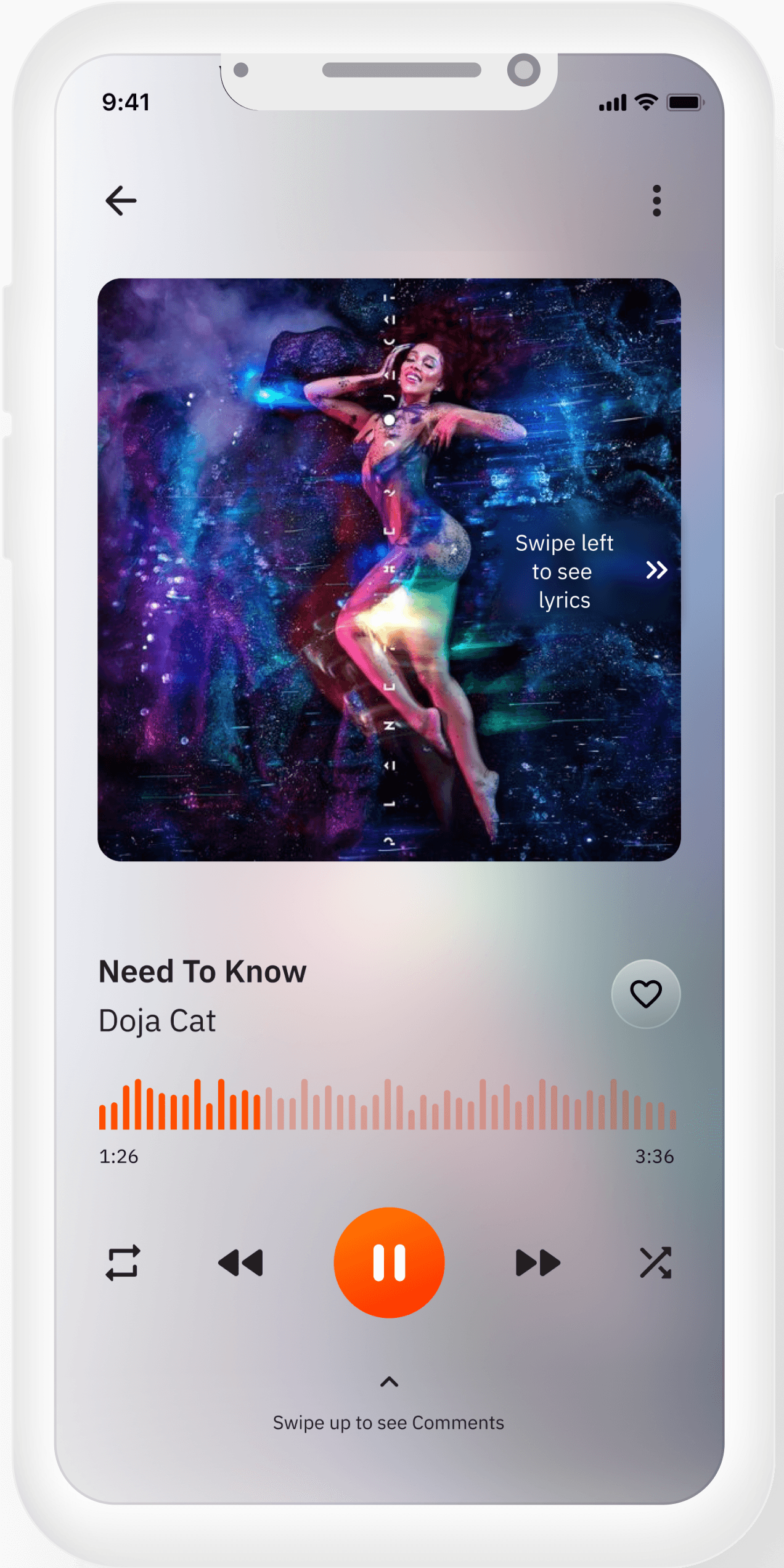
Comments as a modal
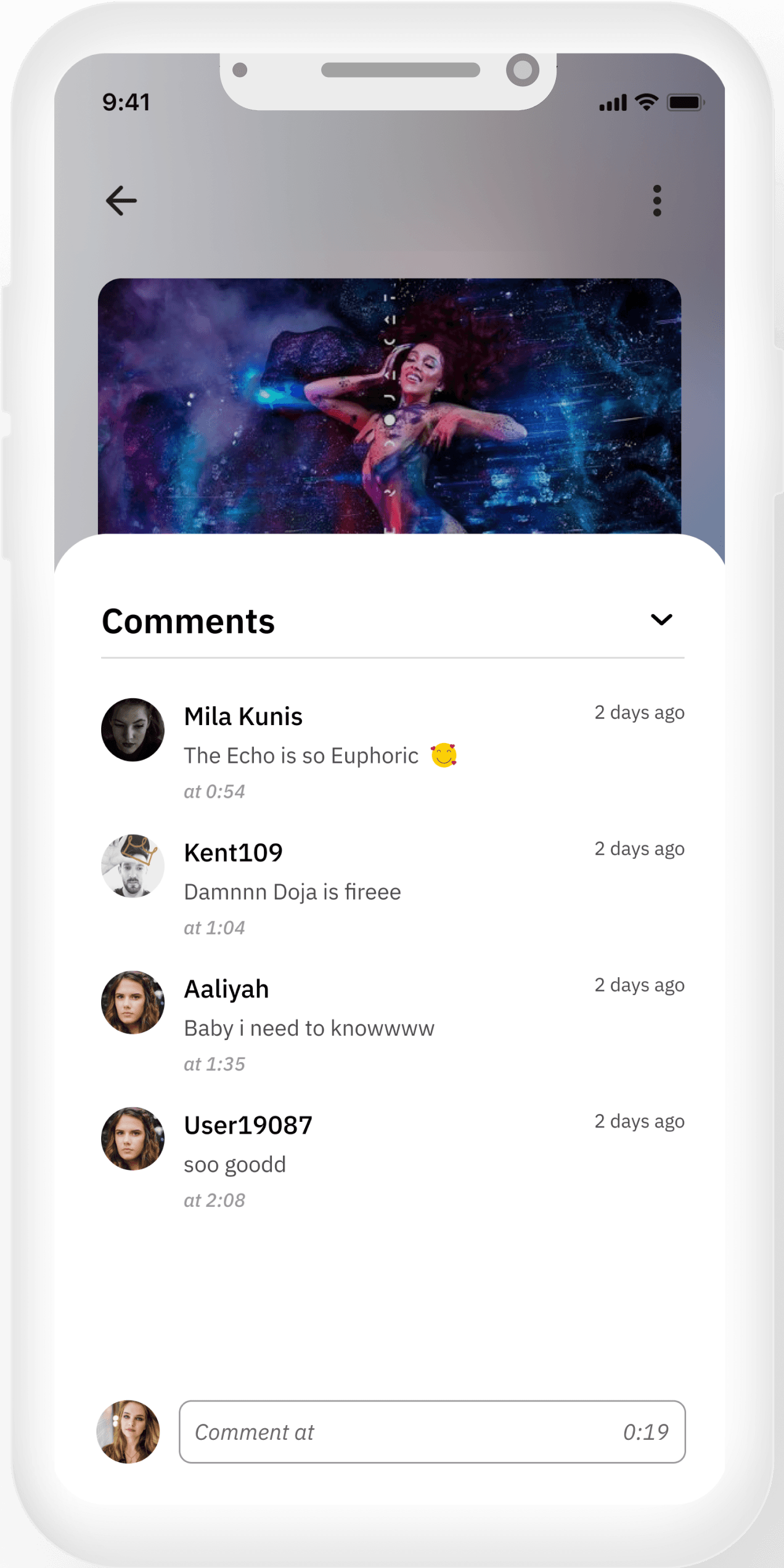
Lyrics available
current Upload Button

Visible Upload Button

Design Process
After finding out the main problems, and brainstorming for new features, I started the design process. I created wireframes for each page relevant to the case study (Authentication and Onboarding, home, play screen, search)
For the High Fidelity, I decided to use the Grommet design system and also design light and dark themes. I used the IBM Plex Sans font family all through the redesign process of the app. For colors, I used Soundcloud’s main color — Orange. Linear gradient of #FF7403 — #FD3501. Here are some screens from the app:
Thank you for reading!
Test prototype here:
** Preferably on a pc**
Next Project
Metrodao
Copyright © 2023 | Chisom Igboanugo
Made with love and lots of Caffeine